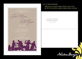
 An old friend asked to design an engagement party invitation for her sister and future brother-in-law. The party is an upscale affair with cocktail attire recommended, so the invitation could have a very formal design. There is also going to be a jazz band, so a silhouetted image worked beautifully. The wedding colors are deep purple and mocha, so I stuck with that color palette to create a truly custom invitation just for this fun occasion.

Please download the order form & send it to me via email: allison@nealondesign.com (button below) If you prefer to simply send me details via email without the order form, that is fine. Please provide the design you would like, event information, size, and quantity needed. I am happy to provide a quote at your request.
Pages
▼
Friday, April 30, 2010
ENGAGEMENT Party Invitation
 An old friend asked to design an engagement party invitation for her sister and future brother-in-law. The party is an upscale affair with cocktail attire recommended, so the invitation could have a very formal design. There is also going to be a jazz band, so a silhouetted image worked beautifully. The wedding colors are deep purple and mocha, so I stuck with that color palette to create a truly custom invitation just for this fun occasion.
Thursday, April 15, 2010
Class Tags LOGO Design
 Class Tags is the only provider of laser cut, acrylic, mirrored license plates focusing on the needs of high schools. They provide top of the line, affordable license plates to high schools and small organizations. It happens to be founded by my brother. :)
 I offered my design abilities to help with the "identity" of his new company. The logo to the left is what my brother came up with as he taught himself Corel. The name of the company, Class Tags shares his same initials: CT, so he wanted to incorporate the combination of those letters into the logo. He also preferred it if "lass ags" could come out of the combined CT. I provided the selection at the bottom of the image above. He tweaked the right design to fit his needs himself, creating the top image. If you look closely, you'll notice that he rounded off all the sharp points of the letters, shortened the cross sections of the T and used a stroke only version of the CT. It was very much of a collaborative effort, and I believe we are both pleased with the final logo.
If you are interested in this product, please visit the Class Tags website to learn all about this great product! There is also a Class Tags facebook page. Check out his sample images to see what it is all about!
Thursday, April 8, 2010
Jennifer D. Miller Photography
 My old friend from our military day's, Jenny Miller contacted me around Christmas to begin working on a logo design for her new photography business. Jenny is a wonderfully talented artist that has many areas of expertise including creating amazing murals, pen and ink drawings, painting and even teaching young people art. She has now shifted her focus entirely to photography and has done an outstanding job in the Augusta, Georgia area...and wherever she travels.
After lots of dabbling, tweaking and revisions, we came up with a solid "identity" for her new business. Her photography focuses on children, families, infants and maternity shots (no weddings) so she wanted something youthful and organic yet with style and professionalism. Once the identity was created, it was just a matter of applying the fun new graphic to business cards, marketing materials and advertisements.
Wednesday, April 7, 2010
Green Damask — COUPLES SHOWER
A Lapis and Latte WEDDING
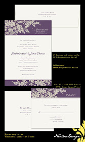
My neighbor's niece contacted me to design her wedding invitations. She didn't have anything specific in mind for her invitations, so I pretty much had free reign. Sometimes this can make the design process difficult. Since I don't know her, she sent me an image of the bridesmaid's dresses that she chose and I spoke with her aunt to get a better idea of her style and taste. My assessment lead me to design elegant, somewhat formal designs for her composition selection.
Her invitation suite will include a 5x7 invitation, response postcard, and flap printed A7 envelopes. Each piece is printed on 100 lb. Cougar Opaque Natural paper and includes an 80 lb. Cougar Natural envelope.
Her invitation suite will include a 5x7 invitation, response postcard, and flap printed A7 envelopes. Each piece is printed on 100 lb. Cougar Opaque Natural paper and includes an 80 lb. Cougar Natural envelope.


