Wednesday, November 3, 2010

Winter Holiday Card

I was recently asked to design a "politically correct" holiday card for our dear friend, and financial advisor. Since he'll be sending these out to all of his clients, he wanted to keep it professional. He wanted a modern look, with black and white as the primary colors. I sent him several design options in a variety of sizes.

He opted for the 4 x 9 horizontal card with rounded corners and coordinating, red envelopes. White would have matched fine, but we didn't want this holiday card to be confused with other business-sized mail.

We are printing his signature on the front of the card, and his return address will be printed on the back flap of the envelope, so hopefully this will save him lots of time when it is time to mail them out!

If you are also looking for a more traditional, non-photographic holiday card, I would me more than happy to meet your design needs as well.

Saturday, October 9, 2010

Dan Vis Builders, LLC

Dan is our neighbor, friend, and one of the amazing builders on our street. He asked me to design a logo for his company, and I was happy to help.

Here is the selection I provided as options. Do you have a favorite?
I am working on the business card design and when it is approved, I will add it here as well.

Friday, October 8, 2010

"SHEPHERD" — Sepia & Patterns Birth & Thank You Card

"SHEPHERD"
So, are these not two of the cutest little boys you have ever seen?! Perhaps I am a bit biased, but I'm allowed because I am their aunt! The newest addition to our family, Shepherd Christian Trotter, arrived 4 weeks early on August 28th. It is my privilege to design announcement/thank you cards in his honor.

Thursday, October 7, 2010

Super Sweet 1st Birthday


Alli Claire is turning 1! Her mom had the super clever idea of printing a full picture on the backside of a 5 x 7 invitation. This way friends and family have a framable picture of the birthday girl!

Most of the designs I supplied Kelly with were loosely based on an adorable dress she is ordering for the birthday girl. I thought carrying over the cupcake and some of the patterns would tie the two together nicely.

Check back for coordinating thank you cards with a picture of Alli from her party!

Wednesday, September 29, 2010

Traktr Chrome tshirts

On my personal, family blog, I have a link to this design blog and it says "Nealon Design...everything but book covers". I think this stretches pretty significantly: trucker tshirts!

My neighbor is the head of marketing and I was happy to help out, even if it required me to expand my thinking for product and target market. :)

Wednesday, September 22, 2010

"We've Moved"

My husband was active duty in the Air Force for 6 years. During this time, we met many absolutely fantastic people, specifically, the McDaniels .The guys met while stationed together in Georgia, then we all moved to Maryland at the same time. We didn't time it so well for our European excursions. We were in Germany for only one year and as we were moving back to the states, the McDaniels were just beginning their German adventure. Three years later they are once again stateside.

I was thrilled to create a very custom change of address card for these dear friends.

Monday, August 16, 2010

Connor's Cars Birthday!

I can't believe my little guy is turning 2 on Sunday! For a while, we were watching the Disney/Pixar movie, Cars once per day. It is a good thing it is such a cute movie with great music! Connor has also really loved playing with some of the diecast cars characters from the movie, so it was fitting for him to have a "Cars" themed birthday.

Luckily for me, Cars 2 is coming out June 24, 2011 and the logo for the movie has already been released. This worked out perfectly because I was able to alter the logo from "Cars" to "Connor's" using a similar typeface and it coordinates with his 2nd birthday! After several designs using multiple characters, it looked too cluttered. So, I opted to one basic design with 16 different cars. So, each invitation is unique!

I also found some cool, free, high resolution Cars coloring images on the internet. I used them on the back of each card to create a little coloring sheet for the kids.

Overall, I'm pretty happy with how they came out. Of course the best part is the Connor wants to play with all the invitations. :) I'm pretty sure he approves of the design.

If you would like personalized invitations for your child's birthday, please email me. See the full Cars Birthday Invitation suite here.

Tuesday, August 10, 2010

Baseball Birthday #1...or any age...

This is a retro post from my son's first birthday in August of 2009. My husband loves baseball and I was happy to jump on board a baseball themed party. I am well aware that the first birthday is as much of a celebration for the parents as it is for the child...if not more so. We invited the whole neighborhood and all of my family came in from out of town for the festivities. So, I had to go all out...5.14.11 Updated to show options and feature a 2-year old party invitation as well. All of the content can be changed to meet your needs. The size of this invitation is now 3.5 x 8, fitting into an #9 envelope. I would also love to do a retro-antique-y version of this invitation, so if someone gives me an excuse, their design fee will be waived.In line with the baseball theme, I thought it would be cute to design tickets to the party. We've been to many MLB games, so I had many old tickets to use as inspiration. I created a collage of 4 pictures through his first year of life and formatted the rest specific to his special day. The faux barcode has his birth date and time. The party details are repeated in the tear off section with special instructions with the r.s.v.p.

First let me say that I am not a party planner, nor do I want to be. I usually stop at invitations and paper/crafty stuff. But I thought I'd share a few of my other crazy ideas....that were likely way over the top...

I wanted the name of each child that would be attending because as their party favor, each child got their own pennant! It took me a while, but I cut every stinkin' one of those letters out of felt. :) I think the kids (ages 1-9) really liked the favor and it made a great decoration for our mantle.I dreamed up the idea for the cake several months before the party. Seriously...I dreamed it. I wanted to make a whole stadium. The field was made out of 2 giant cookie cakes put together. The bleacher seats in outfield, complete with "fans" were made using small cupcakes. I even had a crazy idea that they needed to be multi-cultural, so we used a variety of cake mixes: chocolate, yellow, white, & spice. My fabulous sister-in-law piped "hair" onto the fans in different styles using chocolate icing or yellow icing tinted yellow with food coloring. The same "fans" held signs with letters spelling out "HAPPY BIRTHDAY" and Connor was written in the outfield. The grass was made using two different shades of green sprinkles over white icing. Connor's smash cake held the #1 candle and was in the middle of the outfield bleachers. Normal size cupcakes decorated like baseballs lined the rest of the field. I know...a little over the top. Thank goodness my family was in town and willing to help because my sister-in-law and I were in a car accident several hours before the party! Thankfully no one was seriously injured, but it certainly added additional drama to the day!

Prior to the actual day of the party, I made baseball cake balls, stuck them on lollipop sticks and put them in a baseball Easter basket with a big styrofoam ball to hold them up...complete with green "grass". These were relatively easy to make and went over big as a sweet little appetizer before we cut the cake. Leave a comment if you want me to post directions. Don't look too closely...they are NOT perfect at all, but you get the point and not bad for my first try. :)

And the last homemade element of the party was the onesie I hand painted for Connor. This is what he changed into after he got a little messy from his little smash cake. Of course he is pictured riding one of his brand new birthday gifts!

Connor won't remember the party or any of the extra touches I did to make his day super special. However, I have fabulous memories of planning and executing and I love looking back at the pictures. They are a wonderful reminder of what a wonderful time we had, with lots of little baseball details....all with my special little slugger in mind. We are so blessed.

Wednesday, July 21, 2010

PALMS BIKINI-LINE Beach Bachelorette


--2016--
I just updated this listing and have added it to my NealonDesign Etsy store! The design is now available in a fancy "curvy" shape with your choice of 3 standard color schemes (I am also open to color requests).
Please click HERE for a direct link to this listing to place your order! Thank you for your interest!

--2010--
I had so much fun working on this little project. My sister-in-law is hosting and wanted to tastefully combine both lingerie and the beach into the invitation. She came up with the idea of the clothesline of lingerie between palm trees and I just ran with it.

These invitations are 3.35 x 7.35, "monarch" & double-sided. Printed on 100 lb white paper, trimmed with rounded corners (not shown above) and come with white envelopes.

I hope the girls in attendance like their invitations. They are sure to have a fabulous time!

Tuesday, July 13, 2010

Toy Story Birthday Invitation

Being little can be so fun! Ava is having a Toy Story themed birthday party and her mom sought me out after having a hard time finding cute, personalized invitations for the event. I had a blast researching and coming up with a handful of fun layouts for her to choose from. Janine couldn't decide, so she let Ava choose, and this was the favorite. I think she made a good choice. :)

Wednesday, July 7, 2010

RECIPE Shower Invitation


My fabulous sister-in-law brought me this business for her best friend's recipe shower. Let me just say that these turned out super cute! Those that know me are well aware that the smallest things can make me so happy. In this case, it is my trusty paper cutter with a perforation attachment that allowed me to create a very functional, and quite adorable (if I may say so myself) tear-off recipe card! Each guest will provide the bride-to-be with a new recipe and coordinating gift (pans, spoons, etc.).

The invitations are 5 x 7, and the recipe card is a double sided 3 x 5 card. I printed these on the heaviest stock my printer can handle: 130 lb cover stock, so each card is almost twice as thick as a normal index card. This will help preserve the recipes and great memories from her shower for years to come!
Thursday, June 24, 2010

ALEX — Textured Band Graduation

I was contacted to design these graduation postcards upon receiving the ones I designed for Nathan Paytosh's graduation. She wanted something similar....full bleed front and nothing too themed, just classic. I lowered the color saturation of the image to create a more muted look. This is an alternative to black and white or sepia and still allows for a little pop of color.

Wednesday, June 16, 2010

A Tiger 10-Year Reunion

Isn't a save-the-date postcard for a high school reunion an excellent idea? Hopefully these spirited tiger cards will increase the awareness and turnout for this Virginia high school. I had such fun designing these postcards with a front gloss coating. The back side is uncoated so an address label and reduced priced postcard stamp will adhere beautifully!

Sunday, June 6, 2010

Letterpress Wedding Invitations

An old friend and sorority sister contacted me several months ago to design her wedding invitations. She wanted letterpress invitations and already knew all of her specifications from the printer. I was hired to design all of the individual pieces and submit them to her printer.

After all the pieces are printed, Lindsay is also saving money by adding the flat invitation card into a gatefold card with ribbon herself!

I can't wait to see how the final printed pieces come out.

Tuesday, May 18, 2010

Subtle Floral — BRIDAL SHOWER

I had a lot of fun working on invitations to this bridal shower being held at a winery! I provided a slew of designs. All were elegant and appropriate for the event, but several were very specific to a shower a winery. Although one of these designs wasn't chosen, I thought I'd include them as a sample.

Wednesday, May 5, 2010

An Elegant 80th BIRTHDAY

My 4th grade teacher contacted me to design some invitations to her mother-in-law's 80th birthday celebration. I comprised a set of age appropriate designs, while also using modern color schemes and typefaces.

Friday, April 30, 2010

ENGAGEMENT Party Invitation

An old friend asked to design an engagement party invitation for her sister and future brother-in-law. The party is an upscale affair with cocktail attire recommended, so the invitation could have a very formal design. There is also going to be a jazz band, so a silhouetted image worked beautifully. The wedding colors are deep purple and mocha, so I stuck with that color palette to create a truly custom invitation just for this fun occasion.

Thursday, April 15, 2010

Class Tags LOGO Design

Class Tags is the only provider of laser cut, acrylic, mirrored license plates focusing on the needs of high schools. They provide top of the line, affordable license plates to high schools and small organizations. It happens to be founded by my brother. :)

I offered my design abilities to help with the "identity" of his new company. The logo to the left is what my brother came up with as he taught himself Corel. The name of the company, Class Tags shares his same initials: CT, so he wanted to incorporate the combination of those letters into the logo. He also preferred it if "lass ags" could come out of the combined CT. I provided the selection at the bottom of the image above. He tweaked the right design to fit his needs himself, creating the top image. If you look closely, you'll notice that he rounded off all the sharp points of the letters, shortened the cross sections of the T and used a stroke only version of the CT. It was very much of a collaborative effort, and I believe we are both pleased with the final logo.

If you are interested in this product, please visit the Class Tags website to learn all about this great product! There is also a Class Tags facebook page. Check out his sample images to see what it is all about!

Thursday, April 8, 2010

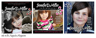
Jennifer D. Miller Photography

My old friend from our military day's, Jenny Miller contacted me around Christmas to begin working on a logo design for her new photography business. Jenny is a wonderfully talented artist that has many areas of expertise including creating amazing murals, pen and ink drawings, painting and even teaching young people art. She has now shifted her focus entirely to photography and has done an outstanding job in the Augusta, Georgia area...and wherever she travels.

After lots of dabbling, tweaking and revisions, we came up with a solid "identity" for her new business. Her photography focuses on children, families, infants and maternity shots (no weddings) so she wanted something youthful and organic yet with style and professionalism. Once the identity was created, it was just a matter of applying the fun new graphic to business cards, marketing materials and advertisements.

One of my favorite parts about this logo in particular is that the color scheme can change to fit a mood or season, yet is solid all by itself in plain old black and white.

Wednesday, April 7, 2010

Green Damask — COUPLES SHOWER

I love that I was able to design these invitations to a couples shower for dear friends. Her wedding colors are a beautiful bright green and ivory, so I incorporated both into an elegant, damask design.

A Lapis and Latte WEDDING

My neighbor's niece contacted me to design her wedding invitations. She didn't have anything specific in mind for her invitations, so I pretty much had free reign. Sometimes this can make the design process difficult. Since I don't know her, she sent me an image of the bridesmaid's dresses that she chose and I spoke with her aunt to get a better idea of her style and taste. My assessment lead me to design elegant, somewhat formal designs for her composition selection.

Her invitation suite will include a 5x7 invitation, response postcard, and flap printed A7 envelopes. Each piece is printed on 100 lb. Cougar Opaque Natural paper and includes an 80 lb. Cougar Natural envelope.