Friday, December 16, 2011

Katman Customs LOGO

With so many holiday card designs to complete, I was finally able to finish up the identity design for Katman Customs. It is a new embroidery company in New Jersey.

When designing their logo they wanted to use a hot pink and kelly green with a pop of dark blue. They also already had sew in labels from Cherry Hill Designs using a very specific script. I wanted to use this somehow so they could continue to use the labels and they would still match! I had to do some research on which font was used, but I found and obtained it. I provided a variety of concepts and this is the end result.

double sided business cards with rounded corners and high gloss finish
2" square stickers with logo and web address

Tuesday, December 6, 2011

Silhouetted Deer Holiday Card

I'm very pleased with how this card turned out. The family wanted to use an image representing the three members of their family. I found a stock image of a single silhouetted deer in the winter woods. A little work in Adobe Illustrator and I was able to create 3 deer, one for each family member.

I love the classic, simple colors and type. To make even more elegant, the card is digitally printed on #110 metallic coverstock in "quartz", with rounded corners. The "jupiter", metallic, euro-flap envelope matches the corners nicely and includes the return address.

Thursday, December 1, 2011

Old Christmas Cards...ha.

Finding the 2006 card inspired this post, but it only makes sense to add them chronological order.... Prior to 2005, I didn't do all the design on the computer, so I'll have to find physical copies. I may have them or maybe my mom hung onto hers from each year???

2005
Brian deployed. Dominican Republic. Kitties. First Ohio State game in "the Horseshoe" vs. the University of Texas. I don't remember the colors being so drab in person... who knows. Not a very exciting layout, but I do like the typography of the "N" and the year.


2006
I was looking through an old Snapfish "album" and came across our Christmas card during the one year we lived in Germany while B was still in the Air Force. (Snapfish does NOT print my cards.)

I'm glad I've gotten better since then and know a lot more!! I wonder if I can find more blasts from the past??


2007
Check out this dark hair. I actually like it for a change. Can you tell this is pre-kid? We did live within walking distance to PetSmart and they told us to bring Mitsy and Toonces to see Santa. :) At least the design is better. A holiday card & change of address!

I'm pretty sure I didn't send out cards in 2008. :( That is what happens when you have a 4 month old that doesn't nap and you find out your a moving AGAIN in the middle of winter.


2009
 I made up for it in 2009. We had 3 different versions and I actually started designing cards for other people! It was also double sided (just not shown here). All three designs used the same concept with the snowflakes, but 3 different pictures.
 4.25 x 5.5


2010
Another sepia picture (a little less antiquing this time). Double sided with rounded corners and our annual Christmas "letter" on the back. Look very closely to find the year on the front. I like to do it subtly.
2011


  2011's card is brighter. The front photograph was professionally taken, but I actually did quite a bit of additional editing in Photoshop (like taking Connor's face from another picture in the same session) to get a picture that was actually good of all of us! There were so many pictures that I loved from the year and wanted to include them on the back, so I went for a bit of a collage approach with our update in the middle. I designed it in both a 4x6 and 5x7 size.

Now I am determined to find more...old ones....even if I have to scan them in! I need to wait until I'm not so busy though...priorities, Allison...priorities. I've got to find the one from 2003: the year we got married and it has a picture of us in bride/groom Mickey ears from Disney! :)


Sunday, November 20, 2011

LACE Save-the-Date POSTCARDS

I am so excited about these save-the-date postcards and I can't wait to see how the invitation suites come together! I am not a huge lacey person, but I LOVE how this lace is subtly combined with a modern script and bold, engravers-style font. I intend to carry over the subtle use of the lace onto the invitation design as well. I always try to create a common theme within all of the pieces of the wedding package.

These economical, double-sided postcards are 4x6 in size, allowing a postcard-rate stamp. The front will be coated in a high gloss covering for additional durability during mailing. The back will remain uncoated for easy addressing. I've even added very faint lines to aid the addressing process.

Stay tuned for additional pieces within this suite!

Tuesday, November 15, 2011

Polka-Dot Cupcake Birthday Invitations

Have I mentioned that cupcakes are popular?

I got a recent request: 1st birthday, black and white polka-dots with dark pink, cupcake & a picture.

I provided quite a few options, but this is the design that was chosen. I love the colors, subtle black and white picture and the fact that I got to use one of my new fonts!

I am happy to play around with the color scheme to fit your needs. I'm testing out something new by adding the pricing to the image....we'll see how it goes! I also think it would be an easy change to make this for a bigger girl birthday....just change out the number! I even think this would be very cute for a sweet 16?!
There are also lots of "extras" to make the invitations suite complete! You can order thank you card sets at the same time as the invitations, or wait and use an image of the birthday girl with cake all over her face! There is no additional design fee for any of the extra pieces. The fold-over thank you card and return address wrap is also available in white.

Thursday, November 10, 2011

BRIGHT Holiday Card

Sometimes one has to be very politically correct and simply send out a winter or holiday card....as opposed to a card highlighting a specific religious holiday. Although it makes me a little sad that some card recipients look passed the intention of the card; a greeting, and take offense, this bright, cheerful, politically correct holiday card does make me happy.

4 x 6, double sided (back not shown here....same snowflake pattern with sender's contact information)
high gloss finish, rounded corners
Sour apple A6 envelopes with return address printing

I have other politically correct designs available as well. Email me to see options.

Wednesday, November 9, 2011

Gingerbread House {Decorating} Party Invitation

"Gingerbread Mousse"
Isn't this a cute idea for a party?!

I had a lot of fun creating these design compositions for a fun, youthful, festive holiday party for little ones (and their moms, too!) The first is the design that was chosen, complete with super cute return address wrap stickers and festive, red envelopes in the traditional Christmas color scheme.

I really liked this one too, so I thought I would add it as well. It uses more of a candy color scheme and I love the red/light blue combination with the fun font, called Delight Script. Thus the name of this one is "Gingerbread Delight".

I'm sure the party will be a blast.....I'll be decorating a house with my little guy for the first time this year, too. :)

Tuesday, October 25, 2011

A Fabulous Couple

I had the pleasure of photographing this fabulous couple last year for their holiday card and they asked me to help out once again this year. We had a lot of fun walking around our little downtown area and were able to get quite a few great pictures.

This is still definitely a "just for fun" aspect of my little business, but let me know if you are local and would like me to snap a few pictures of you and your family. :)

Monday, October 24, 2011

Birthday CUPCAKE


Cupcakes are big at little kid birthdays. Cute. Easy. No cutting. Portion control. :)

This invitation was designed for a first birthday, but I think it would also be cute for a bigger kid as well....just send me the wording you'd like to use. Both a boy and girl version is shown above.

Colors are completely customizable.

Saturday, October 22, 2011

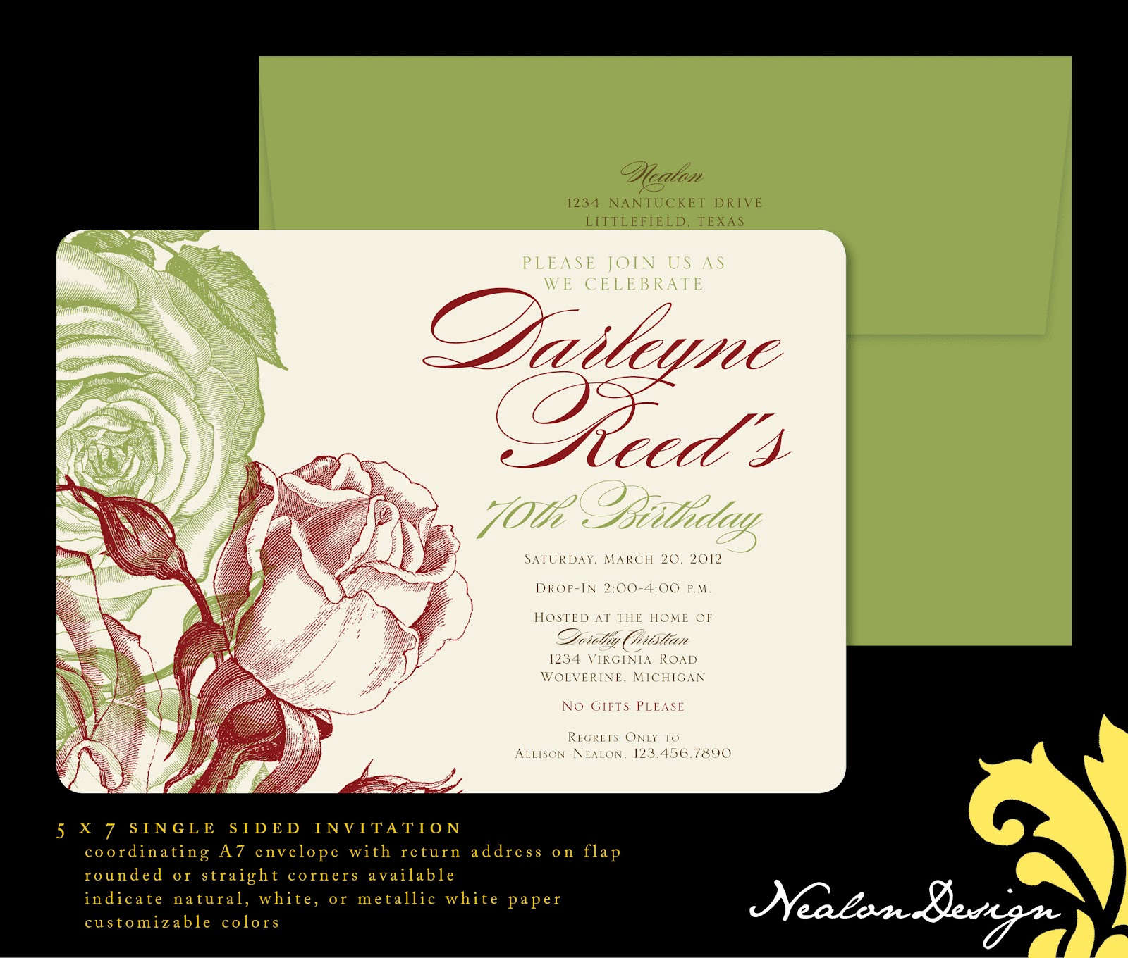
Roses 70th BIRTHDAY

 I design invitations for many children's parties, but I think adults should get the same special treatment....especially older adults hitting milestone birthdays!

I love roses and I love line art. The color of the roses in this design are completely customizable. There are also 3 paper color choices: white, natural, and a fancy "metallic white". Use the same colored envelope or pull out an accent color like the gumdrop green in the sample above.

I really want to expand my selection of adult birthday invitations, so let me know if you need to plan something special and what you have in mind. I would love to create something custom just for you!

Friday, October 21, 2011

Bridal Brunch — Wedding SHOWER

Bridal Brunch (Monogram) — Wedding Shower
I've been doing a lot of "cute" stuff recently, so this "fancy" invitation was a fun departure.

I'm sure there are casual brunches all over the place, but when I think of a "bridal brunch" shower I am reminded of fancy serving pieces, little tea cakes, finger sandwiches and ladies in pretty dresses drinking delicately out of tea cups. :) I may be way off, but that is what I think of when I hear "bridal brunch".

Using the brides wedding colors of silver and blue, I came up with several designs with a little bit of glam. This was the design chosen. To make it even a little bit more special, the invitations are printed on a 110 lb. metallic white coverstock with a coordinating, designed metallic envelope.

This invitation is easily customizable to fit your color scheme and is sure to make any bride feel special.

Bridal Brunch (Teapot) — Wedding Shower

I don't usually post images of designs that were not chosen. However, I just love this one and hope that you do, too. There is a subtle toile pattern in the background and a vintage, antique, teapot at the top...perfect for a morning brunch. I also think that this invitation could be manipulated for a generic brunch invitation.

Of course I altered the colors (from the original blue/silver) and I can change them to whatever you wish to fit your needs.

If you would like to order either of these invitations, email me and specify which design you prefer: Teapot or Monogram.

Thanks!


Thursday, October 20, 2011

"GIA" — Subtle Zebra Birth Announcement

"GIA"
Double-sided 5x7. Also available in a 4x6 or 4.25x5.5.

I designed this custom invitation for good friends.  She provided a variety of photos and the instructions of "purple and green". I took it from there. I gave her several designs to choose from and she gravitated to the zebra print. With a few modifications, this is the end result. :)

I am happy to customize this design just for you or come up with something unique and special just for your little one. :) Email me for more information!

Tuesday, October 18, 2011

Pink Tink - Fairy Birthday

3.5 x 8.5 with a white #9 envelope.

Little girls love princesses, fairies, and PINK.

I altered Tinkerbell's traditional coloring to go with this pink design with fun fonts and patterns your little girl is sure to love. The number of balloons can change based on your child's age. The fun patterns open many doors for fun party decorating! I can also make "Tink's" hair brown, if your little girl is a brunette.

Monday, October 17, 2011

Divas & Dudes BIRTHDAY


A cute idea for a young boy/girl party.

The "divas" arrive early to get all dolled up and then the "dudes" come a bit later for a lot of fun!

The client specifically requested using pink and black as well as a zebra print. I think it turned out very cute and we tied in the guys with a silhouette and a punch of electric blue.

These are an economical 4x6 size with matching pink envelopes.

Email me for customization options or to order!

Saturday, October 15, 2011

Peek-a-Boo Paintings BUSINESS CARDS

My extremely talented friend asked me to update her logo and design some business cards for her prosperous custom painting business.

She has a love for, and uses a lot of polka dots in her designs. It was only fitting to incorporate this pattern into her new design. I also used youthful fonts because the majority of her work is for young children.

Please check out her work on etsy and order today! You'll see the etsy banner I designed for her when you click on the link to her site!